Friday, May 7, 2010

Final Project

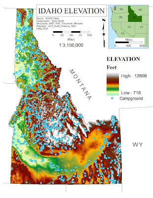
For my final project, I chose to do an Idaho map and a Florida map. The Idaho map is an elevation map that also outlines every campground in Idaho. I chose to do an elevation map because I’ve always been interested in the elevation changes and variations within Idaho. It is a known fact that if you were to lay Idaho at an even elevation and stretched it out, the state of Idaho would be bigger than the state of Texas! Ever since I learned this little bit of information it has been an interesting thing to ponder about and think what it would be like to have “everything’s bigger in Idaho” type conversations, rather than “everything’s bigger in Texas” type conversations. The campground layer gives you a perspective on how elevation and campgrounds are correlated (more on this later).
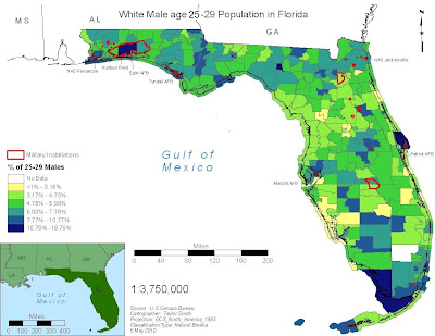
The second map I made was a population distribution in the state of Florida. I am a 27 year old white male and I wanted to see where my demographic was a majority in Florida. I will be moving to Florida this summer and will be stationed at Naval Air Station (NAS) Pensacola. This is why I also added a “military installations” layer in my Florida map. It is neat to see the distribution of my demographic and how well it is related to military instillations within Florida.

--Old Map--
--New Map--
--Old Map--
--New Map--

Monday, April 26, 2010

Assignment # 6 Part UNO + UNO + UNO = 3


This is a map of Buffalo, NY. It shows the unmber of 22-29 year olds and also the correlating percentage of 22-29 year olds in the same area.

Assignment #6 Part Duex (2)


This map shows the major capitol cities in the world.

Assignment #6 Part Uno (1)


This is a dot map that shows the population of African American people in the state of Idaho.

Wednesday, April 21, 2010

Map o' da Week! 2+2+100-100=4


This image doesn't have any map elements, but I don't think that its a true picture. i think its a few layers of imagery layed on top of each other. You can see the ocean floor contours and shapes, and you wouldn't be able to see that in an original photo. Its totally awesome though, ya dig!

Wednesday, April 14, 2010

Map o' da Week # 5-2=3


This map is the route that my family and I will take when we move to Florida. Its a long drive, but should be exciting! I love the Google Map viewer because it is so interactive and easy to use. There are also a lot of integrated menus and subtasks that you can use as well.

ASSIGNMENT 5


--Part 2--

I used the Kriging interpolation method. This map shows the wetter areas (blue) and drier areas (red) and the distribution between the extremes. This color scheme shows where the dry areas in Idaho are and where the wet areas are. I chose to not put the weather stations in because it was too busy with 150+ dots on the map and the color scheme. The map isn’t as detailed with the number of contours as the IDW method conveys.


--Part 1--

I used the IDW interpolation method. This map shows the wetter areas (blue) and drier areas (red) and the distribution between the extremes. This color scheme shows where the dry areas in Idaho are and where the wet areas are. I chose to not put the weather stations in because it was too busy with 150+ dots on the map and the color scheme. The map is very detailed with the number of contours.